Category Archives: Part 2 – Elements of Design

Assignment 2: Tutors report


Have received my Tutor’s report for my second assignment and am fairly pleased with it:- 

“Overall Comments.

You have chosen a specific theme to use for this assignment concerning a sculpture by Henry Moore situated in Scotney Castle. This one sculpture provided the elements required to conveniently suit this exercise. You have added your preliminary thoughts on this assignment with a selection of suitable images that would also fit the brief.

Assessment potential

‘I understand your aim is to go for the Photography Degree and that you plan to submit your work for assessment at the end of this course. From the work you have shown in this assignment, providing you commit yourself to the course, I believe you have the potential to succeed at assessment’.

Feedback on assignment

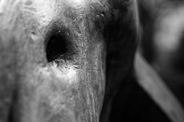
Single point dominating the composition. This sculpture does dominate the composition, as it is a man made bold object placed in a natural wooded environment. Shown in black & white does blend the subject with the surroundings to some extent with similar tonal range. The second image showing a close up of part of the work that looks like an eye stands out as a single point that is quite dominant in this composition. The photograph appears to resemble an elephant’s head and eye.

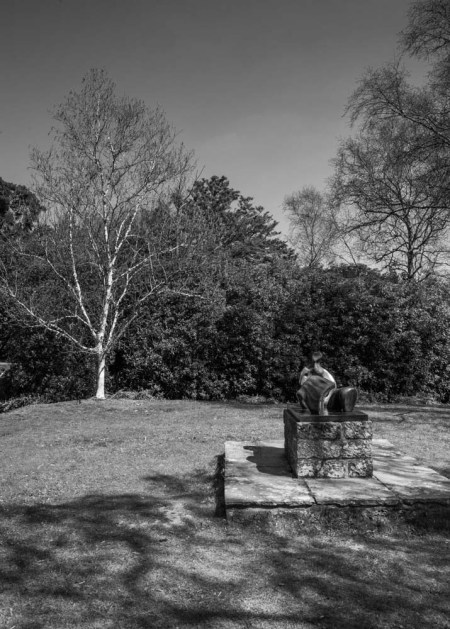
Two Points:  The image depicted here shows a dominant silver birch tree in alignment with the sculpture thus forming the two points. The bright sunlight emphasises the silver trunk of the tree where the eye is drawn immediately to this and then bounces towards to the sculpture.

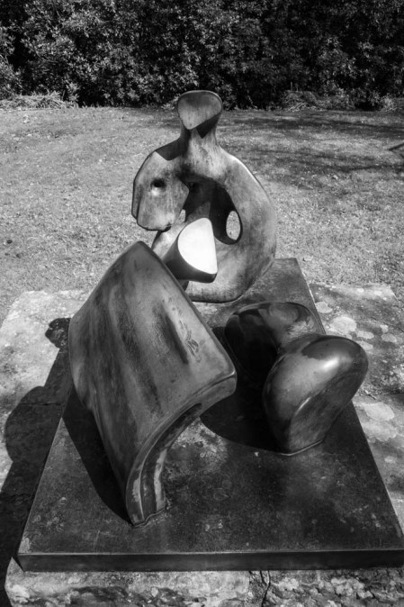
Several Points in a deliberate shape:  This is a very attractive composition of the sculpture where this has lent itself to be shown in black & white specifically. The lighting is ideal on a bright sunny day allowing the natural shadows to give depth to the image. One can appreciate the many shapes of this structure in this nicely composed image. Along with many shapes the photograph shows arches, triangles and implied triangles that complement this composition. I can understand why you chose this image as your frontispiece.

A combination of vertical and horizontal lines: The plinth happens to be a natural subject to show both vertical and horizontal lines in one image. The silver birch trunk echoes the upright stone brickwork of vertical lines quite nicely. Horizontal lines are displayed from the bricks, mortar lines and stone base of the structure. There is a good three-dimensional feel to this image where the tree trunk is placed out of focus using f/5.6 open aperture.

Diagonals:  Even though this shot is contrived to produce this angle, it demonstrates the category in this theme. Looking at the various shots of this sculpture, I can see other areas where this is also evident either as natural or implied versions of diagonals.

Curves:  You have shown two distinct examples of curves within the sculpture that cover this part of the assignment adequately. The first shot at standard focal length shows a good depth of field and excellent lighting to reveal texture and interesting features of this work of art.

Distinct if irregular shapes:  The sculpture once again has afforded you an opportunity to cover this particular category within the carving. One could say that most of the sculpture is a mass of distinct and irregular shapes!

Implied triangles: Your two examples cover this aspect well and there are others within the shots you have taken, such as DSC03525 in the tree branches and DSC03739 within the shape of the sculpture base.

Rhythm: With the example you have depicted here, it demonstrates a flow of the sculpture elements that could cover this aspect rather than having to deviate from your subject matter.

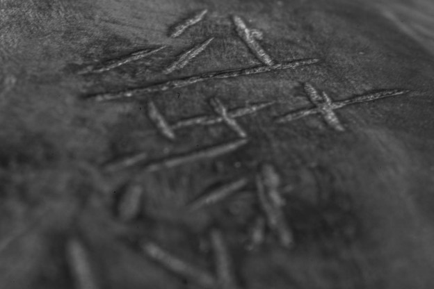
Pattern: The markings are deliberate on the statue and seemingly drawn in a haphazard fashion, may mean something to the artist or may even be decipherable? Nevertheless it does show the theme of some sort of pattern that has taken place in this sense.

Congratulations on coming up with an inspirational idea to use one subject to demonstrate the themes required for this assignment. It has challenged you to use your observational skills, which for a photographer are crucial in producing imaginative material. As you say in your summary, it brings out the creative skills to seek out the most effective shots.

Learning Logs or Blogs/Critical essays

https://richardbrown56taop.wordpress.com/

Keeping sketchbooks and a learning log/blog is an integral part of this and every other OCA course, not only because they constitute 20% of your marks if you choose to have your work formally assessed but they are also an excellent way to see how you are developing.

Thank you for sending me images of your learning log. It is quite extensive and will form an important part during the assessment stage once the course has finished. I imagine you are keeping this in a binder and with the inclusion of links to your Blog will indicate to the assessors the amount of research and work you have ben engaged in to produce this information.

There is no doubt you have researched thoroughly and are producing a most interesting and informative blog. As I have already intimated, your preliminary shots for this assignment have also produced creditable images suitable for this project.

As you are no doubt well aware, your course finishing date is 16th October 2015, so I would recommend you make a timetable to complete this before that date. Can I suggest you try to submit assignment 3 in July, assignment 4 in August and assignment 5 in September, as you will then need to submit for assessment following the completion of the course.

 Suggested reading/viewing

Useful websites to view.

https://theartofphotographybysuzy.wordpress.com/category/assignments/assignment-3-colour/

http://cblearninglog.wordpress.com/category/assignments-for-taop/assignment-3-colour/

http://nicksoca.webs.com/photography1/artofphotography/colour/colour.htm

Pointers for the next assignment

‘Colour’. This is about colour relationships and colour harmony. Follow the colour wheel to ascertain the various different colour effects that make up the harmony aspect of a photograph. Opposite colours such as Red/Green are complementary, Similar colour sit alongside each other and Contrasting colours are those that are about thirds around the colour wheel such as Red, Blue, Yellow (the primary colours) also Black and white are contrasting colours. Seek out natural images such as the colours that make up a building, wall, plants and clothes. It is best not to contrive a shot to achieve the result.”

I feel my choice of subject and treatment has been a good one and from the feedback it appears my Tutor does too.  I am both looking forward to, and worrying about, the colour exercises as this has been an aspect of my photography that I have not consciously given a lot of thought to.

Research for Part 2

In response to my first assignment my tutor suggested I ought to look at the these sites to get some idea of how others have tackled  it:-

http://www.pbase.com/byker28i/ocaassign2&page=all

I enjoyed the stylised studio shots of fruit and veg illustrating the various exercises and thought several of the shots were very witty (I loved the snooker shot)  Personally I am not one for doing a lot of set up shots although this may be something I explore in the upcoming exercises.

http://cblearninglog.wordpress.com/category/assignments-for-taop/assignment-2-elements-of-design/

I know Catherine from various study groups and had seen this blog before, one thing I picked up from revisiting it though was the idea of having a “shopping list” of things to shoot/include.

http://theartofphotographybysuzy.wordpress.com/category/exercises/part-2-elements-of-design/

I liked the unusual (and possibly difficult to shoot?) choice of subject (Marine life) here and how that choice has led to some imaginative and very detailed shots.


Assignment 2: Elements of design

The brief for this assignment was as follows:-

The idea behind this assignment is to incorporate the insights you have learned so far on the course into a set of photographs directed towards one type of subject. You should produce 10 –15 photographs, all of a similar subject, which between them will show the following effects:

 single point dominating the composition two points several points in a deliberate shape a combination of vertical and horizontal lines diagonals curves distinct, even if irregular, shapes at least two kinds of implied triangle rhythm pattern.

Choose from these groups of subjects:

flowers and plants     landscapes   street details     the raw materials of food.

if you prefer, choose your own subject.

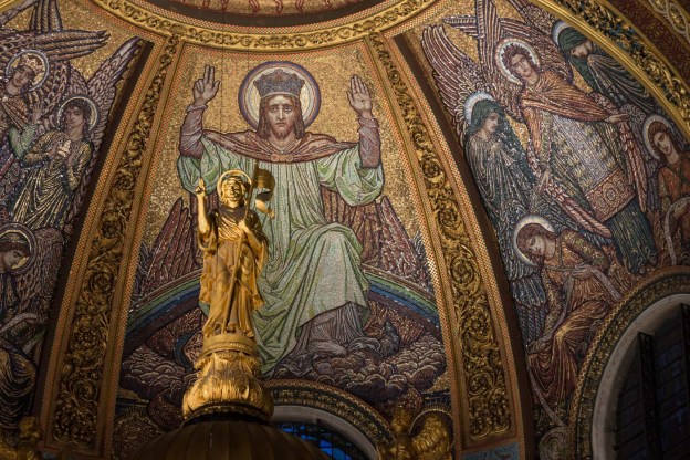
I considered the subjects suggested, but did not find them as interesting as I would like, although of them all I was most tempted by “street details” as I do enjoy street photography.   I had considered, in addition to the suggested topics racing at Lydden Hill (and went as far as shooting last time I was there in anticipation of the assignment) ; Church interiors (like wise) and woodland but came up with the idea of using a relatively small subject after seeing a Henry Moore Sculpture in St Pauls Cathedral.  This reminded me of a three piece sculpture at Scotney Castle in the grounds there.  It is small sculpture for a Moore (as I understand it) but thought it would be an interesting challenge to see if it could provide the shots necessary for the assignment.

It is entitled “Three Piece Reclining Figure – Draped” and was given by Moore to Christopher Hussey, who willed Scotney Castle to the National Trust.

There are of course plenty of photos already of the sculpture (Google Henry Moore Scotney), but these in the main are of the whole thing, and while I did similar takes on it I also wanted to get closer to its component parts.

single point dominating the composition       

As an unnatural element in a natural setting, the sculpture and its plinth stand out. F16 1/60 130mm ISO400


DSC03593

The eye like indentation in this part of the sculpture aided both by the highlight at circumference and the shadow inside. F5 1/1600 70mm ISO400

two points

DSC03525-2

There is kind of competition here between the sculpture and the white(silver birch I think) tree behind it. F16 1/160 24mm ISO400

several points in a deliberate shape     

DSC03647

Taken with an ultra wide angle the two components of the sculpture at the front of the image, by their similar arcs, lead to the third component at the rear, aided by the latter being less in the shadows. F16 1/40 12mm ISO400

a combination of vertical and horizontal lines

DSC03754

The plinth provides both horizontal and vertical lines both with the overall shape and the mortar connecting the bricks while the vertical is reinforced by the white trunk in the back ground. F5.6 1/2500 70mm ISO400

diagonals     

DSC03582

Diagonal created by angle of shot. A bit of interest added by the bug that landed as I was taking the shot. I considered this shot for the rhythm entry so to speak as I thought the series of algae (lichen?) leads your eye into the frame. F20 1/80 35mm ISO400

curves

DSC03551-2

The liquidity of the sculpture is full of curves but depending on the angle of the shot other shapes can be created or implied such as the triangle here. F14 1/40 50mm ISO400


DSC03592-2

The marks on this part and elsewhere were I think deliberate and imply (at least to me) some sort of clothing. In any event I feel they reinforce the curve in this shot. F5 1/1000 70mm ISO400

distinct, even if irregular, shapes     

DSC03585-2

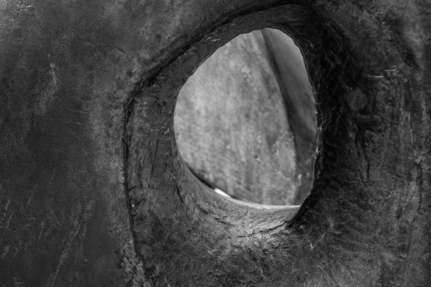
An irregular circle leading to a further surface on the sculpture. F5 1/1000 70mm ISO400

at least two kinds of implied triangle      

DSC03535

Apex at the top with the head of the sculpture forming the tip. the three components forming the triangle. F11 1/250 26mm ISO400


DSC03576-2

Apex at the bottom or at least nearest the camera this time. The relatively wide angle accentuates the nearest component and relegates the other two to be the base of the triangle. In addition there is also an implied triangle (arguably stronger) in the plinth. F18 1/60 24mm ISO400


rhythm     

DSC03548

This in the context of the exercise and using the sculpture was the trickiest aspect for me but I liked the progression to the rear here with the first part pointing the way and the final bit highlighted by the reflection. F14 1/40 50mm ISO400


pattern.

DSC03690-2

A close up (with macro lens) of the deliberate (?) markings on the sculpture. These were only about two centimetres long and I liked the trail effect here. F32 1/10 90mm ISO400

I used black and white because I felt that apart from a small amount of patina the sculpture is to all intents and purposes a monochrome object and I think using black and white emphasises its form.

I turn now to the assessment criteria

Demonstration of Technical and Visual Skills

Compared to the previous assignment I think there is more demonstrated here with the use of different lenses, the angles and settings employed.  As is often the way there are shots I thought of, after I returned home and reviewed the two hundred plus shots I had taken, even though I gave myself enough time at the site to think about the shots before I took them, and how I could use different lenses to get them.

Quality of Outcome

I am happy with the results here and I feel that I have come up with a set of shots that covers the brief of the assignment.  Of them all, I think the Rhythm and Pattern shots are the weakest and this may be because of the self imposed constraint of the subject I chose.

Demonstration of Creativity

I think in terms of the subject chosen and the use of that subject there is an improvement from the previous assignment.

This is why I chose this subject for the assignment as, by its nature, it would force me to be creative more so, say, than trying to fill the brief by street shooting.  I liked the challenge of finding the various required shots within the sculpture most of which worked I think.

Context

I’ve been looking at magazines for ideas and these have been copied into my learning log but for this exercise the main source of reference has been  The Photographer’s Eye by Michael Freeman.  In particular chapters two and three of that book “Design Basics” and “Graphic and Photographic Elements” were very useful.

I also been reading by the same author the e-books of “Capturing the Light” and “Capturing the Moment”


Assignment 2 – preliminary thoughts and shots

This assignment is, to an extent, a sweep up exercise to include all the elements, previously  covered in this section, in a series of ten to fifteen photos.

As it happened I had a couple of opportunities coming up where I thought I may be able to fill the brief so to speak.  The first of these was a Rallycross meet at Lydden Hill and the second was a one 0ff photographers meeting at St Pauls.

While I got some of the shots required (see below) I didn’t get them all, and so decided that I would choose a subject myself with a view to specifically shoot for the exercise rather than shoehorn it in to a activity.  I don’t think doing that is a problem so much with the exercises but, having considered it, I think the assignment shoot (or shoots) need to be specifically for that purpose.

In any event I thought it would be of interest to see a few examples of the ones that I thought could be used:-

A.  Lydden Hill

DSC01087-2

Single point

DSC01025-2

Implied triangle – the red points.

DSC01048

Curve

DSC01013

Rhythm

DSC01000

Defined Shape -rectangle

DSC00991

Defined shapes – circles

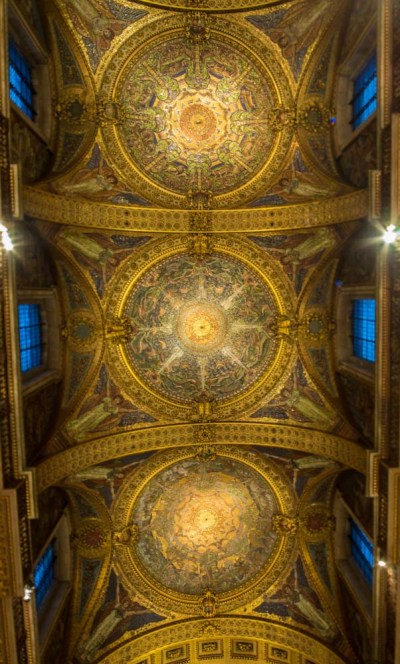
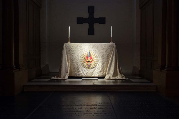
B. St Paul’s Cathedral

DSC01677

Implied triangle

DSC01665-3

Two points.

DSC01661-3

One point

DSC01580-2

Rhythm

DSC01656-2

Distinct shapes

DSC01519

Rhythm

DSC01618-2

Single point


Rhythms and patterns


Like a lot of this section of the course on of the elements that are the subject of this exercise is often incorporated in shots on an almost subconscious level.   In other words the shot is taken and it is only afterwards that, on further deliberation, you have included diagonals, verticals, curves and rhythms as well.   Patterns are I think, as far as my shooting is concerned, a more conscious choice and I think the reason for this is that patterns have a danger of being a boring composition unless, like the example in the coursebook, you have something to break it up and or add extra information to the shot.

I looked through my past shots and its very hard to spot any pure pattern shots and had to think for some time before I came up with the shot below.


DSC01719

The pattern here of the frogspawn is emphasised by the solitary tadpole. F25 1/60 90mm ISO400 of camera flash to left of subject.

Rhythm on the other hand is an easier spot.  The Calke Abbey shot below was taken with this exercise in mind (along with several others) and was not a hard shot to identify (and I  would have taken it anyway without the exercise at the back of my mind), the same going for the other examples  shown.


DSC09550

There’s a double rhythm here I think. Firstly the row of stable arches and then these repeated as a kind of coda in the painting. Taken at Calke Abbey.

DSC01651

Lamps in the choir stalls at St Pauls shot with a tilt shift lens to accentuate the rhythm of the recession of the line of lights leading to ceiling in the distance.


DSC09547-2

There is a flow to these mushroom structures that leads you in the shot. In hindsight I should have shut down the aperture to get them all in focus as this would have worked better.


DSC09913-2

The lead here is from the top left to bottom right created by the row of narrow boats with the single plume of smoke just adding a bit of mystery.


DSC09850

One bin leads you to another and so on down the road.

I was thinking about what this says about me as a photographer.  I concluded that maybe I just do not like the order that is, normally, inherent in pattern shots but prefer and identify easier the randomness of rhythm.


implied lines

The exercise is to determine the presence and direction of implied lines within a shot be they eye-lines or lines of direction – or both.  They are, I think, usually present when there is some form of action or interaction is being photographed.


implied lines

Like a lot photographs these two ask the viewer to make his or her own decisions on them including where the implied lines are. The implied lines in the bullfight shot are the circular movement of the bull around the matador as indicated by the scuff marks on the stadium floor. Secondly is the implied eyeline of the matador, by necessity, watching the bull. In the second shot there is again an implied line of direction this time of the lead animal towards the right of the frame reinforced by the angle of its movement, There is also an implied eyeline, and possibly a two way one, with the lead animal and the man. not as strong is the possible eyeline between the second animal and either the man or, more likely because of the angle of the head, the lead animal.


DSC09518

This is a sort of double implied line, both forward and reverse. On the one hand the main walker implies a line leading out of the bottom left hand corner of the frame while, on the other, the row of cars take you back into it up to the top right.

DSC09841-2

Taken at Stowe I like the eye-line from one of its monuments to another. Its not, necessarily a straight line but borders firstly of the columns and secondly of the plants lead the viewer to the far off monument .

DSC01616

The eye-line is fairly obvious here, with the camera and the shadow emphasising it, but there is, arguably, an implied line of sight in the gap between the chairs


DSC00765

Although the face is not visible the obvious interpretation of the shot is that the figure is watching the starting line. Shot at a Rallycross meeting at Lydden Hill, Kent


DSC01422

Here there are three line extensions. The viewer knows that, ordinarily the cars would follow the curve of the track, In this case therefore its possible to extrapolate three lines based on the position of the cars in the photo. Again taken at Lydden Hill.
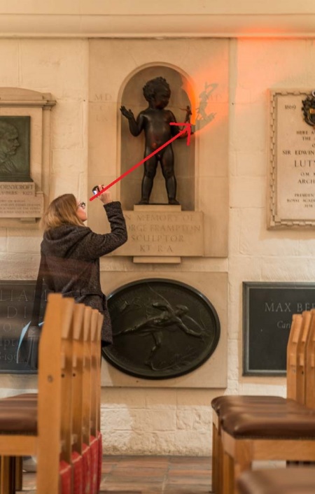
As with previous exercises there is almost a subliminal instinct to take shots with these eye-lines or lines of direction as they are an important aspect of composition.  The shot of the press photographer above for instance without the starting grid of cars in the distance would not, I think be as compositionally strong,   Similarly the shot of the three cars would be weaker without some of the frame to go into.


Triangles

I used a recent visit to London to get shots of implied and actual triangles.

A.  Implied triangles

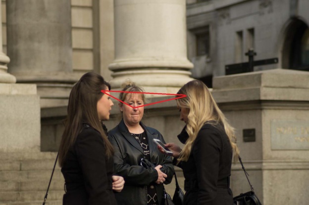
DSC00491-2

The points of the implied triangle here is the face, elbow and phone

DSC00521

The bike and rider make, for me, a dynamic triangle.

DSC00468-3

The angle that the three columns are taken at forms an inverted triangle of the ornate tops.

DSC00469-3

I think this is a bit more subtle as the compression of a zoom lens at 300mm create a group of three people whereas in reality the lady in the middle had no connection with the couple nearest to the camera.

This on the other hand, with what appears to be three generations, is a more connected inverse triangle.


B.  Actual Triangles.


DSC00528

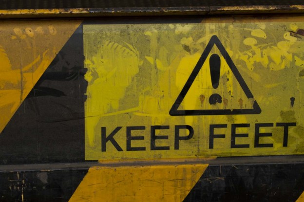
Warning sign.


DSC00529

Inverse triangles of the fruit cones.

DSC00527

Possibly the most well known triangle in London – The Shard.

DSC00530

You could argue whether this is an actual triangle or an implied one

C.   Still life

In the second part of the exercise you are asked to create two triangular set ups – apex at the top and apex at the bottom.

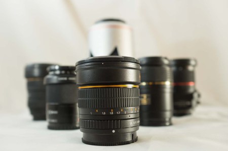
I decided to use some lenses for the subject and played around with various set ups:-

DSC00614-2

Looking down. While this is clearly a triangle it’s not a very exciting one.

DSC00611

With the apex at the top it is slightly more interesting.


DSC00610

The low angle creates in my view a more dynamic composition while still creating, albeit less obviously, a triangle.


DSC00602-3

The same angle with the apex reversed


DSC00595

The in between angle of the above. Again the triangular shape is clear and the spacing of the lenses in the frame is better I think although arguably the picture is not as dynamic.

D. People

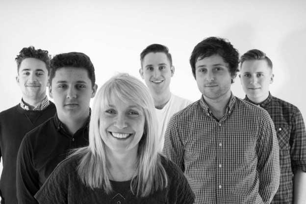
These two shots are from a studio shoot I did for my girlfriend’s birthday with her five sons.  During the session there were a number of arrangements but these two represent the most “triangular.”

DSC00301

DSC00305

I think I tend to spot these compositional shapes, be they rectangular circular or triangular, on an almost subconscious level at the point of shooting and then more proactively at the selection/weeding out process.


Curves

The following photos were again taken in the Pantiles area of Tunbridge Wells.


DSC08753

The curve of the kerb is accentuated by the yellow lines.

DSC08731

I felt there was a series of curves here:- the white wall; the implied curve of the windows; the parapet and then the balustrade. To my eye they encourage you to sweep across the frame.

DSC08725

I could have shot the chair but liked the delicacy of its shadow and the multiple curves in it.

DSC08720

I liked the way the tree edging here stood out against the paving and the cobbles forming a barrier both to the pedestrian an d the viewer as your eye is directed round the frame.

As in previous exercises I though I would include some subsequent shots I took with this exercise in mind.


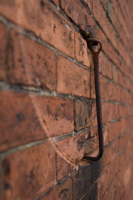
DSC09567-2

Taken at Calke Abbey I liked the implied movement in the curved mark left by the door hook.


DSC09629

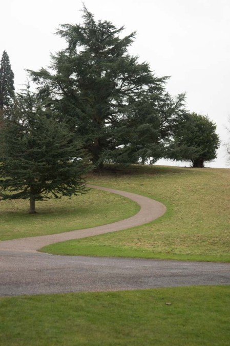
The curve of the path takes you somewhere hidden from sight.

DSC08924

The interior of a pillbox next to Bodiam Castle. The curve of the metal plate is reinforced by the bolts securing it and even though it is an immovable object to my eye your goes round it so any movement is unconscious.


Diagonals


As the course book states, diagonals can be created fairly easily by  altering the camera angle, but they are often found naturally anyway.   These shots were again taken on my walk around the Pantiles in Tunbridge Wells.


DSC08774-2

King Charles the Martyr Church, Tunbridge Wells. I liked the angle of the pews and the way they are lit by the window.


DSC08742-3

I liked this because its another image which has a combination of lines both vertical and diagonal. In this case however I think it is the diagonal that is stronger because it is a more dynamic active line.

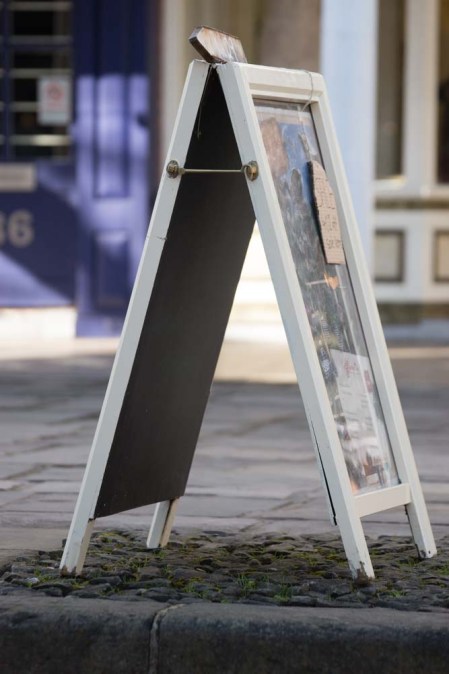
DSC08718

The two strong diagonals of the sandwich board help give it a feeling of solidity.

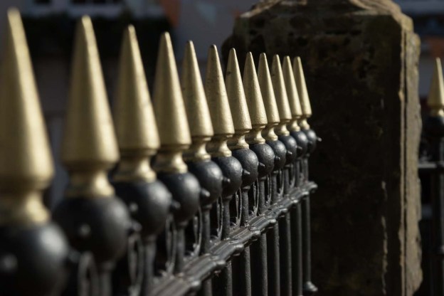
DSC08745

Another shot where the choice of angle has determined the diagonal. My eye was drawn not so much by the gold points but the round bases of them. I’m not sure if the limited depth of field works in hindsight or whether it would have been preferable to have them all in focus

As in the previous exercise on subsequent trips I was looking out for examples and came up with these:-


DSC09659

Servant’s bells at Calke Abbey. Because of their height on the wall you have no choice other than to take them at some sort of angle but here their diagonal line is compounded by the signs underneath.

DSC09818-2

A deliberately created diagonal of the bridge at Stowe. I wanted a different take on this so shot at a very low angle


DSC09806-3

The converging diagonals of the row of trees and their protective fencing attracted me to this shot, taken at Stowe.


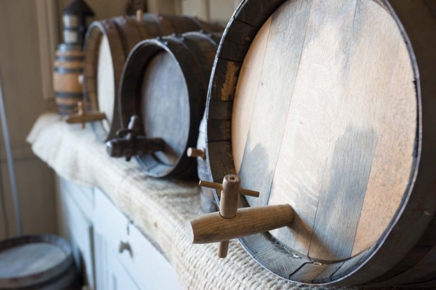
DSC09778-2

This is more of an implied diagonal line (of the spigots of the barrels) again taken at Stowe.


Horizontal and vertical lines

For this exercise I returned to the Pantiles and Tunbridge Wells common.

I found verticals to be easier to spot than horizontals and took these:-


DSC08756

Iron Bollards I liked the regression here with the sequence curving away into the distance.

DSC08726

Window bars

DSC08715

Drainpipe Although there is also a horizontal line caused by the way the building is constructed I felt that the drainpipe was a much stronger line.

DSC08706

Trees at Tunbridge Wells Common The formal planting of these reinforces the vertical lines.


DSC08713

Park Bench the horizontal line is, for me, reinforced by the plaque.


DSC08903

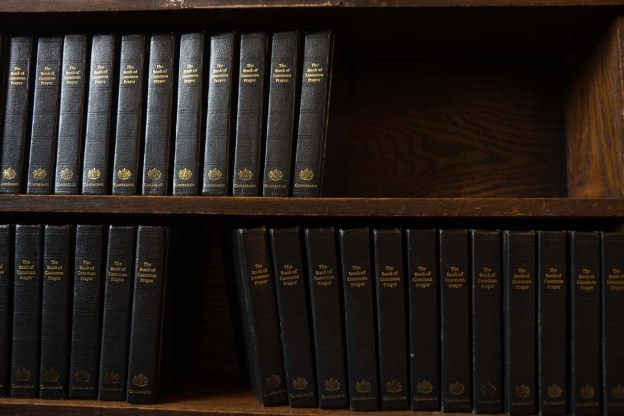
Hymn Book shelf at King Charles the Martyr, Tunbridge Wells. While there are verticals in this shot the overriding element is the horizontal row of books and the shelf dividing the shot.


DSC08738

Steps Although not running right across the frame the step stones nevertheless, to my mind, dominate the picture.


DSC08750

Wheelie Bin enclosure. Although not perfectly horizontal (and I realise I could have straightened this up in Lightroom but wanted to leave it as shot) the horizontal element is still the strongest in the photo.

DSC08699

I liked this image because it has both vertical and horizontal lines and these compete with each other. On balance I think it is the darker horizontal lines (but is this because the frame is landscape orientated?) that the eye is drawn to but I do find the image vaguely unsettling because of the clash between them.

As to the choices I made for the shots there are some that are pretty obvious (the tree trunks spring to mind) but found that as mentioned identifying ideas for vertical shots was, it seemed to me, easier than doing so for horizontal.  Is this a general thing or we designed to spot verticals easier?  For both this exercise and the subsequent ones on diagonals and curves I kept an eye out for more examples particularly at new places I visited:-


DSC09715

An interesting one in the context of the exercise is this shots of the plant posts at Calke Abbey. Although the vertical post is front and centre to me it is the shelfs that are dominant probably by virtue of being a stronger colour and reinforced by the pots themselves.

DSC09844

This could also qualify the exercise on diagonals but I liked the verticals in this shot with the recession echoed in the shadows on the wall.


DSC09602

I think this shot of the old stables at Calke Abbey supports the idea of the horizontal line as being a natural base