Author Archives: Richard Brown

Assignment 5 tutor’s report

Here is the Tutor’s report on my fifth and final assignment.  My responses, such as they are, are in italics.

Overall Comments.

You have chosen to illustrate a story for this assignment featuring

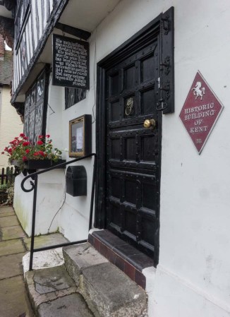
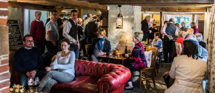
The Abbot’s Fireside Hotel, Elham, Canterbury. (dating from the 15th century).

This hotel, bar and restaurant has great provenance with its connection to the time of the ‘Duke of Wellington, who used it as his headquarters before his final clash with the French emperor Napoleon. It also served as a hideout to King Charles II and the Duke of Richmond during troubled times’. It seems to be a fitting tribute to the building and Kent history as well as a suitable advertising pictorial brochure for the present owners.


Assessment potential

‘I understand your aim is to go for the Photography Degree and that you plan to submit your work for assessment at the end of this course. From the work you have shown in this assignment, I believe you have the potential to succeed at assessment’.

 Feedback on assignment

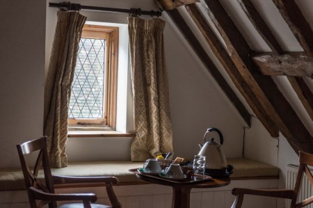
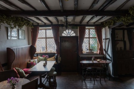
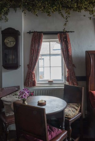
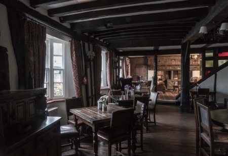
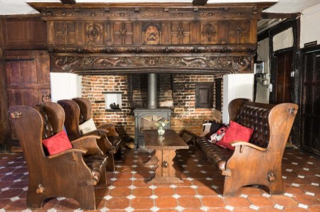
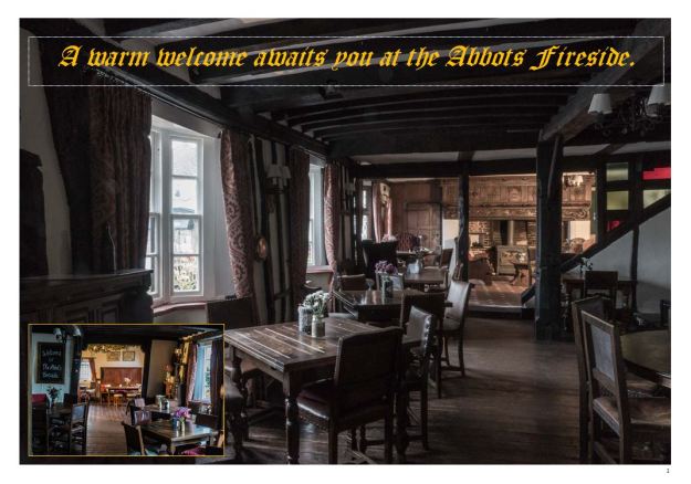
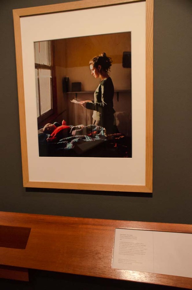
For the first page and cover picture, you are asked to use some of the techniques of illustration that you have been experimenting with. This you have done successfully. The photo is headed by the name of the hotel with a warm welcome, which is inviting the reader to look further. The photograph is taken with mainly natural light and captures the character and atmosphere of the room. It is an old building but the décor is fitting to its character and preserve and your illustration has recorded this. As its name implies, you have included an attractive fireplace, which now houses a wood burner stove, still surrounded by the brick and intricate carved wooden centrepiece that adorns the lintel above the fireplace. It is also nice that you have inserted another photo showing the opposite end of the room.

I was not sure about the inset to start with but this seems to be a common aspect of the spreads that I was modelling the assignment after.  It is a useful way of livening up what would otherwise be a fairly mundane part of the picture.

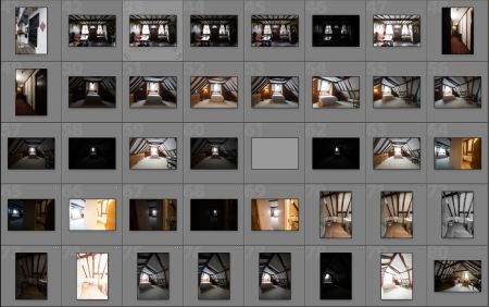
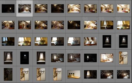
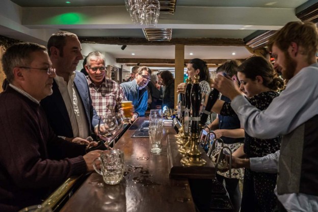
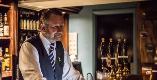
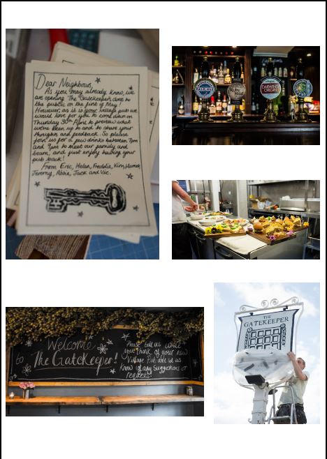
Page two consists of five photos with important captions that inform the reader of the function of the building and further information regarding the surrounding area to explore. The page enlightens the reader with the charm and historic interest of the establishment.

ass 5 tutor report 1

I have now sorted out the alignment and the printed pages i have submitted for assessment reflect the repositioning.

Page three has a further 8 images that portray the interior with useful contact details. The photographs give a flavour, ambiance and comfort of the hotel and a sense of a warm welcome that patrons come to expect.

ass 5 tutor report 2

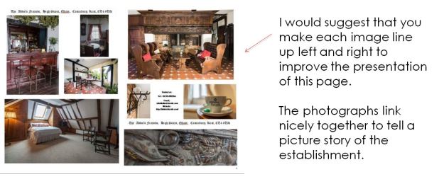
Again i have repositioned the photos so they are all aligned on the vertical and horizontal edges.

Learning Logs or Blogs/Critical essays

Thank you for including your exercises in the follow up to this assignment. It is clear you have worked hard on this aspect of the course and have presented extensive examples of your research and subsequent photographs appertaining to the exercises presented in your blog.

In your reflection you have given comprehensive cover of your thoughts and express you own view to the quality of the outcome, demonstration of your creativity and context. Overall you have given a good account in your learning log of the experiences you have encountered along the way and produced some very useful and imaginative images during the course.

https://richardbrown56taop.wordpress.com

Keeping sketchbooks and a learning log/blog is an integral part of this and every other OCA course, not only because they constitute 20% of your marks if you choose to have your work formally assessed but they are also an excellent way to see how you are developing.

Your Blog is also up-to-date with good references from research and reflection.

You should now bring everything together in preparation for assessment. It will be a good idea to check with Head Office when the next assessment takes place and whether you are able to make the deadlines. I have enjoyed looking at your work during this course and wish you every success for the future whether it be for further study or you own enjoyment.

Final thoughts

I think one of the most enjoyable aspects of doing this module, and indeed the whole course, is the new experience of studying other photographers both famous names and not so famous – including fellow students.

My research i think needs in future to be more focused, organised and more relevant both to the assignments but also to my own taste and development.  I found it very easy to get waylaid by the massive amount of information online and in the books and need to be perhaps a bit more selective.

What has also bee interesting is the amount of stuff I didn’t know; or thought I knew but incorrectly and also what I had forgotten.  So the module in some respects has been a very good refresher course as well as opening up whole new vistas relating to photography. 

Assignment 5 Applying the techniques of Illustration and narrative.

Well here’s the final assignment for this module based on doing promotional material for a lovely old Kent building – The Abbott’s Fireplace .

This is, in some ways, a follow up to the story of the Gatekeeper opening in the earlier exercise in that this is another property my ex wife and her partner have taken on.  Although it has a bar, it is not strictly speaking a pub – more of a guest house, although the intention is to eventually make it, in addition, an upmarket restaurant.  It is an “Historic Building of Kent” and is described on the website (http://www.historic-kent.co.uk/buildings/historic-inns-and-hotels.html) for these as follows:-

“This excellently preserved building, which also comprises a restaurant, has not been altered in terms of structure and offers the experience of medieval open fireplaces, original wooden beams and lead window frames. The hotel is also furnished with antique furniture, which adds to its character. Throughout its history, the building has boasted many notable visitors, such as the Duke of Wellington, who used it as his headquarters before his final clash with the French emperor Napoleon. It also served as a hideout to King Charles II and the Duke of Richmond during troubled times.”

I originally came up with the idea of doing one of those trifold A4 brochures such as you find in racks in hotel foyers, but after playing about with this idea I thought that the constraints of fitting in the photos in the three columns did not do the photos justice:-.

Abbotts fireside brochure

The aborted brochure format

I then thought that, as an alternative, it would be an idea to do a spread illustrating the Abbott’s Fireside – like one of those articles you find in county magazines (http://www.kent-life.co.uk/home) that are almost adverts for the place itself.

The shots were taken one morning before the place has officially opened.  All were shot with a tripod and are mostly using natural light and/or the lights in the rooms.  I did on a couple of the shots, however use some studio lights to highlight certain areas.  I ended up with some 169 shots including multiple exposure where necessary):-

Contact AF 1

Contact sheet 1

Contact AF 2

Contact sheet 2

Contact AF 3

Contact sheet 3

Contact AF 4

Contact sheet 4

The photos used in the final selection are shown below:-

DSC05868-4

Natural light but slightly overexposed to remove the grayness of the sky.

DSC05862-4

Interior shot carefully positioned to hide Gents loo sign behind the crossbeam above the chair, again slightly overexposed to lighten the sky.

DSC05830_1_2

A combination of three exposures at normal, -3 stops and +3 stops to bring out the shadows and nullify the highlights.

DSC05823

Natural light angled to get the window and the highlights on the kettle.

DSC05821

Narrow depth of field used to accentuate the nearest metal support

DSC05802-2

Narrow depth of field again used to bring out the cup’s lettering. I wanted to include the window to emphasise the lightness of the room.

DSC05758

Used the rooms lighting to brighten up the left hand side of the shot which otherwise was in shadow and also add a bit of warmth to the scene.

DSC05741-2

Another merged exposure to lighten up what was quite a dark area.

DSC05739

Natural light shot at this angle to exclude the cars parked next to the premises and to highlight the historical building sign.

DSC05735

As above I would have like to have a shot of the whole frontage but the cars parked there made it difficult to get a good photo.

DSC05733

Another interior shot exposure, highlights and shadows adjusted to get both internal and external detail.

DSC05732

Highlights brought down to show exterior detail and shadows brought up to show interior detail.

DSC05730-3

In this shot I used the premises own lighting, and a studio modelling light (at right hand side )at the far end of the shot to bring out the shadows.

DSC05729-2

Combined exposure to get detail in the very dark area behind the bar,

DSC05721

Natural Light and soft modelling light to the right and at an 45′ angle to the carving.

DSC05709-2

Another combined exposure, but with studio lights (just on modelling light setting) to left of camera facing square to the image and to the left at an angle.

Here are the photos in the final article form:-

Abbotts article page 1

Page 1

Abbotts article page 2

Page 2


Abbotts article page 3

Page 3

The wording of the article reflects the eventual use envisaged for the Abbott’s Fireside.   I had a look at other students work and was debating as to how much to use in the article.  I decided that in this case I would not go overboard on the wording as I felt the photos gave an accurate summary of the place.   I also referred the preliminary spread to my fellow students and got some useful feedback especially on the font used ( I originally used Olde English font throughout but the feedback I got was that it was not particularly clear in pages 2 and 3 so I changed it to hopefully a clearer one.)  A couple also made the point that there were no people in the shots but this was not something I had control over.   In any event, in my experience of hotel brochures and articles, the majority have been without people in the shots (with the exception of where people are being introduced)

I also considered a couple of shots in back and white but felt that they were not justified and in addition detracted from the warmth of the images in colour.

Demonstration of Technical and Visual Skills

I’m fairly happy with the results of this given the time constraints I had, and feel that I have managed to get both some interesting angles and lighting in the shots.  I’m also happy and the composition of the shots although it occurred to me after ward that by using a small stepladder I may have been able to get some more interesting and unusual angles for the shots.)  It would have been advantageous to have more time to shoot at different times of the day, as opposed to just the morning, to get more lighting effects.  I mainly using a mid range zoom 24-70mm and a wide angle zoom usually at 12mm, both on a full frame camera (which gave me the ability to crop as needed.)  All adjustments made in Lightroom except for exposure merge made in Photomatix.

Quality of Outcome

In terms of the brief I set myself, essentially an advertisement feature in a magazine,  I think the quality is ok and would I think pass muster as being useable for a proper brochure.  The only thing lacking is possibly a shot of the premises in its village context but with all the parking outside this type of shot was not possible.  I think the amount of wording is sufficient and although I did initially include further details about both the rooms and the history of the building I felt it better to keep it brief.  At the end of the day the test is whether the photos would entice you to stay at the guesthouse and think on balance they would.

Demonstration of Creativity

The use of both natural and artificial light (with both existing domestic and studio lights) and the range of shots have given, I think, a good and hopefully inviting idea of the Abbot’s Fireplace.  The subject, and the context in which it was being photographed, did not, I think, lend itself to anything radically out of the ordinary in photographic terms .   Having said that I did experiment with different viewpoints and different lighting to arrive at what is hopefully a reasonable diverse set of images.  I’m not sure that it could be said that there is a personal voice as it could reasonably be argued that I have stuck to an existing format.  That said, the viewpoints I’ve chosen are to some degree, I think, imaginative.

Context

As part of my research I looked at a lot of brochures both for hotels and places of interest.  I also looked at various lifestyle magazines such as Index and Kent Life and the internet to get a feel from what is normally considered the standard for this type of article.

My learning log has some examples of these.

As this is the final assignment of the module I thought it might be a good opportunity to reflect on the module and its impact on me as a photographer.

I think what it has done mainly is to make me both more self critical and more radical (although this assignment may not reflect the latter so much) in that I now tend to think about my images both before and after taking them and as a result probably take less shots but more  that I am happy with, if that makes sense.  It also has encouraged me to think outside the box (not always successfully) and depart from the traditional camera club ethos of taking photos where perfection is valued higher than imagination or creativity.

The other major impact – from study visits; reading (both recommended ad other books) and seeing other students work (both in group meetings and online) – is the exposure to, and inspiration of, other peoples work the vast majority of which I have really enjoyed. Although some of it has made me, if truth be told, feel woefully inadequate, so much more has shown me what is possible and what is worth working at.


Rain

The brief for this exercise is to produce a single image that can be used as a cover shot to illustrate rain.

Like the previous exercise I had an idea in mind that, in execution, did not work out as well as I had hoped.  The idea was to shoot a local church through the windscreen when it was raining  but, on the couple of times I went to shoot, the BBC’s promise of “heavy showers” failed to materialise, so the effect I wanted was not there:-


DSC05898

The heavy showers did however occur later and, serendipity like, while going upstairs I saw the streaks of light on our landing window and liked the effect.  I set up the camera, on a tripod, and made a long exposure of some 25 seconds at f22.  I am quite pleased with the resultant shot and it sort of reminds me a bit of Saul Leiter’s work.

DSC05902

High Brooms in the rain from the window.

Juxtaposition

The brief for this exercise suggests doing a book cover or a photo someone with a possession.   I was intending to do a book cover illustrating the novel Dune by Frank Herbert and went as far as buying some sand from a local builders.  Unfortunately while the idea I had was good (and still is, I think) the execution of it just didn’t turn out well (the wrong sort of sand for starters, the letters looking rubbish, etc) – actually this I an understatement – the gap, between my minds eye visualisation and the resultant effort, was of a grand canyon nature:-

DSC05942

The aborted Dune cover.

Another idea was a fairly simple one – a portrait of me in my study with my gear:-

DSC05933

Me in the study

However I didn’t find this particularly inspiring either.

As a result I had a rethink and came up with the idea for the shot below.  A bit of explanation, this is what my mother’s breakfast normally consists of – cereal and 15 tablets.  I thought the link that both the cereal and the tablets (all 15 of them) have in terms of keeping mum alive was a good one and the top down comparison of the two appealed to me.


DSC05923

Mum’s breakfast


Symbols

This exercise asks you to consider and find symbols representing the five subjects listed below and go on to explain how you would use them in a photograph.  The difficulty with these subjects, as with many you are asked to interpret, in a photo is the avoidance of  cliché.  Similarly as with a lot of symbols there is the possibility of misinterpretation, so context comes into this.  If a photo is part of an article, the “leap” to identifying the symbolism is that much easier for the viewer .

Growth

A bud maybe against a wooden fence illustrating new life in contrast to the dead wood.  (This would also be an idea for the next exercise – Juxtaposition.)

DSC02721

A graph -the clichéd shot of a jagged line going upwards is an easily recognisable symbol of growth.  However it might be interesting to make it out of something so for oil you would show the symbol drawn in oil or something on, say, a white background.  For instance:-

price of oil

With context the symbolism may become clearer:-

price of oil 2

Excess

Scales – photo of a readout of a set of scales showing an excessive weight reading.

Rubbish tip – showing what is thrown away and the amount of waste we produce.

Car Showroom luxury car room with price tags maybe?  I remember a Guy Peellaert painting of Diana Ross in a limo passing what appears to be a ghetto/slum which I thought at the time was a terrific bit of commentary see it on this website:-

Rock Dreams – Artwork of Guy Peellaert

Crime

Door sign (or furniture lock padlock etc) -for instance Neighbourhood watch.

DSC02720 DSC05937

police car(s)

Silence

Picture of mute switch on amplifier/remote

Library/church – Inside of venue without people

finger to lips/hand (or, more threateningly, tape) over mouth

Poverty

I had the hardest time with thinking about this subject but came up with these:-

An empty or near empty fridge.  Maybe use a “value” loaf and dripping?

Food bank with or without a sign indicating what it is.


Evidence of action

This exercise asks you to “Produce one photograph in which it can be seen something has happened.”

This to me is very wide brief (although the guidance also goes on to cover abstract ideas and concepts which, by definition, are harder to convey photographically) as I am of the view that most photos explicitly or implicitly indicate something has happened.   For instance these are some shots I took on several of my walkabouts all of which indicate as I see it some form of action taken:-

DSC02680 DSC02676 DSC02675 DSC02671-2 DSC02670-2 DSC02668-2 DSC02689 DSC02687 DSC02685-2

Some of these could be considered as implied (the shot of the postman for instance implies he’s delivered letters) or explicit (there is no ambiguity about the renovated house – especially when contrasted against its neighbour)    I like the last picture of the above set because this has all sorts of connotations.   At its simplest it evidences that a flag has been erected in a front garden but it could also indicate that the owner has certain political ideas.

DSC02682

In the end I opted for this shot of my mother’s recently installed stair lift.   I thought that by photographing it empty at the top of the stairs there is a clear indication of action(s) taking place – both the use of the chair and it being vacated.

This of course is not an abstract image, symbolism is something which, if I am honest, I have not used much, if at all, in my images (although a planned series, of which the shot below is a precursor, could I guess be considered as symbolic – but only if you know the references)

DSC04918

One of my initial shots for a planned series on the home being a prison.

Using the example cited in the exercise, insurance, I think I would consider, in addition to the examples stated, such symbols as a moat, padlock to be suitable but, like a lot of illustrative symbolism, it can depend on context.  For example a picture of smiling sleeper safely tucked up in bed could illustrate an advert extolling – in its text or commentary – the peace of mind that insurance brings.   Similarly a smashed door could symbolise the effect of not being insured – “do you want to come home to this?” or a man living rough on the street symbolising not having redundancy insurance.

As a postscript, I revisited the speed sign shown above in the postmen shot as it was not working at the time.  It was working this time and I would consider this as a viable alternative choice:-

DSC02716

Evidence of action – speed sign

A double dose of Cameron

This was an unofficial study visit centred on the exhibitions featuring the work of Julia Margaret Cameron at the Victoria and Albert museum and the Science Museum.  In addition we also had time to see the work “Dark Mirror” by Richard Learoyd and a collection of both art and photography entitled “Facing History: Contemporary Portraiture” both at the Victoria and Albert museum.

We started off with looking at Learoyd’s work.  As can be seen from the photo below the prints are a considerable size and, as a result of their means of production, are a true one-off.  They are created by a room sized camera obscura, with the image being exposed directly on to photographic paper.

DSC02526

Richard Learoyd’s Dark Mirror at the V&A

There was a mix of portraits , animals and the mirrors of the title.  The pictures have a an amazing clarity, and it would appear a narrow depth of field (I’m not sure as to the lens used) as well as a (deliberately, it would appear) timeless quality about them.  I thought they were marvellous and went back to see them again before I returned home.

I would imagine that the book of his work, no matter how well published would not be able to do justice to the real thing.  I did have one criticism of the exhibition, nothing to do with the work itself but the way it was displayed. Because of the venue and its lighting works opposite were reflected in the work you were viewing and I am wondering whether it would have been more beneficial to either stagger the pictures (so they weren’t opposite each other) or just have them closer together down one wall.


DSC02529

The display -note the lighting and reflections,

The artist is giving a lecture on 10 February 2016 at the museum which I am hoping to attend.

Links:-

Richard Learoyd

http://www.theguardian.com/artanddesign/2015/oct/23/richard-learoyd-dark-mirror-camera-obscura-photography-vanda-museum-artworks

We then went on to the V & A’s exhibition of Julia Margaret Cameron.

The introduction to exhibition states that Cameron is “one of the most important and innovative photographers of the 19th century.” and adds that “Her photographs were rule breaking: purposely out of focus, and often including scratches smudges and other traces of the artist’s process.”

At the risk of being contentious I have a couple of issues with these statements firstly I struggle to see how she could be regarded as innovative (other than perhaps in her habit of posing and dressing up her sitters.) as a lot of her portrait work is very similar to her contemporaries at the time (based on my admittedly limited research – for instance see http://www.cartedevisite.co.uk/) and I am not persuaded as to the “purposely out of focus” point as there are a significant number of her photos in focus.  Judging by her letters on display she was a shrewd businesswoman (as well as not particularly modest) and I’m wondering if she used the out of focus angle as a USP in order to sell her work.


DSC02565-2

Julia Margaret Camerson

In any event her portraits are powerful and, viewed individually, some have both a potency and, in some cases a pathos, about them:-


DSC02546 DSC02544

DSC02559

This was one of my favourites from this exhibition – Cameron’s portrait of John Frederick William Herschel

However, to me there were almost too many pieces in this exhibition and, in my view, it could possibly have benefitted from some pruning so as to enable the viewer to concentrate on the best and/or most interesting of her work.  On the other hand it could be agued that by including her, shall we say, less successful shots we get more of an insight into her working .   To be fair that is certainly the case with several instances of alternative versions on display:-

DSC02545

Alternate shots of Lady Adele Talbot


DSC02540

Holly, a fellow student, taking notes.

The thought occurred to me while going round the exhibition that many of her photos could pass for paintings and her poses and lighting were, it seems to me, based on existing art rather than any innovative approach.  It is of course possible that I am missing something.  It is the case however that many of her portraits, irrespective of their technical merits, are historically important and valuable from that viewpoint alone.


DSC02537-2

Viewing

We then went on to the collection of mixed media portraits “Facing History: Contemporary Portraiture”

This was a relatively small collection of works including artists such as Grayson Perry, Julian Opie, Thomas Ruff, Maud Sulter and Gavin Turk.  I’m am unsure as to the basis of selection but it was an interesting mix of works

DSC02570

Julien Opie’s Luc and Ludivine get married, No. 7. Opie is well known for his portraits of Blur

DSC02567-4

Tom Hunter’s “Woman reading possession order” I thought this was a wonderful phot with marvellous use of natural light imitating classical art.

DSC02568-2

Top Left:- Self Portrait from the Mirror with a Memory series – Gardiner, Jeremy; Right: Man with Eyes Closed (Walter White) – Brian D Cohen; Bottom Left: Untitled (Stella) from The Library of Human Hard Copy – Jeremy Gardiner, 1984

Link:-

http://www.vam.ac.uk/content/articles/f/facing-history-contemporary-portraiture/

After Lunch we went to the Science Museum’s Cameron exhibition entitled Julia Margaret Cameron: Influence and Intimacy.  It occurred to me that this exhibition, apart from a few artifacts, was not radically different from that of the Victoria and Albert Museum’s offering (and overlapped it in the duplication of some of her work)and it seemed a pity that the two could not have collaborated on a joint venture.

As it was, I preferred the presentation here as it seemed to show the work to better effect, albeit in a rather clinical white space, as opposed to the somewhat overpowering red of the V & A.

What I felt was missing from both exhibitions was any detailed desciption of her methods and indeed her influences.  The “Annals of My Glass House” as mentioned in the top left photo below, and available via the link, indicates that a portrait was taken as “a Raphaelesque Madonna.” but that is the only indication of influence that’s explicit. As an aside “Annals” makes interesting reading as to how she views her own work – and those of others.

IMG_0237-2 IMG_0234-2 IMG_0229-2 IMG_0230-2

I have to admit that I did become a bit Cameroned out and remained unpersuaded, after seeing both exhibitions, that she was particularly innovative.  She’s undoubtedly important to photographic history,if not just from the perspective of gender, but not in my view from a deliberate rule breaker point of view.  It could be argued however that where she does stand out is the ability to promote her work, and all credit to her for doing so.

Annals of My Glass House can be found here:-

http://www.sciencemuseum.org.uk/~/media/Documents/visit_us/Julia%20Margaret%20Cameron%20Annals%20of%20My%20Glass%20House.pdf?keywords=annals


A narrative picture essay

The first part of this exercise was based on (for once) a bit of forward planning in that I considered the opening of a pub run by two of my children an excellent subject for this exercise.  It was however taking place in April so it was clearly going to take place before I arrived at the point of the course when this exercise was required.

The selected pictures are these:-

DSC04286

The invite to the Villagers for the open evening.  I think this needs to be big a) because it is an important scene setter and b) it needs to easy to read


DSC04071-3

The welcome on the notice board. This is also an important scene setter, tying in with the previous image.

DSC04294

The ale selection, along with the next photo, is important to position the pub’s style.

DSC04138-2

Food preparation. The Pub sets out to be primarily an eating place so it was necessary to include this aspect of the evening.

DSC03958-2

Unveiling the pub sign. A self explanatory picture that does not need to be too big as a result.


DSC04299

Interior detail #1. I regard this as a filler shot so no need to be big.

DSC04289

Interior shot #2 I liked the reflection in this as it gives a hint of the interior furnishings. Again I didn’t think this shot needs to be any larger

DSC04074

Interior shot #3 – cider menu. Gives another hint as to the character of the pub and is clear enough not to need enlarging.

DSC04141

Guests arriving

DSC04094-2

Starting to fill


DSC04100

The Landlord (in the mirror) mingling. I think this needs to be a bit bigger as he is an important aspect of the evening as is the mingling.

DSC04108-2

The bar staff I liked the movement in this as a good incidental shot.

DSC04143

The pub filling up, I had this made bigger a) to show detail and b) it evidences the success of the evening.

DSC04166-3

Busy at the bar. Like the previous shot I thought this was worth showing larger as it shows the success of the evening.


DSC04188-2

A happy landlord at the end of the evening

I then considered the layout of these shots and came up with this as a first option on an A3+ paper:-

gatekeeper

Collated A3+ page

I then looked at doing a three A4 page collation:-

Gatekeeper A4 1

Page 1. The invitation shot as the scene setter dominates the page.

Gatekeeper A4 2

Page 2.  I think there is a nice contrast here between the smaller detail shots and the more informative larger shot which tell more of the story.


Gatekeeper A4 3

Page 3. I did try varying the position as in left or right but in the end decided to centralise all of these shots.

I think these separate pages work reasonably well.  The use of “filler” or detail shots is also quite useful to fill awkward spaces.


Assignment 4 – Tutor’s report

Here is my tutor’s report on assignment 4 with my responses where appropriate:-

Overall Comments.

For this assignment you have chosen to illustrate lighting techniques using one of your camera lenses as your subject matter. It is a good object to demonstrate the various ways in using different lighting to produce the four themes required as the lens has a distinct shape and is suitable to demonstrate its texture and form in particular.

You will see from my comments that some improvement could emphasise the effect more clearly with some of the images.

It will be interesting and satisfying to experiment with other kinds of lighting to compare these results when you have time. Try the stages using tungsten, torchlight or even candlelight. Some of the results will be less attractive, but it is enlightening to compare the various light sources.

Assessment potential

‘I understand your aim is to go for the Photography Degree and that you plan to submit your work for assessment at the end of this course. From the work you have shown in this assignment, providing you commit yourself to the course, I believe you have the potential to succeed at assessment’.

 Feedback on assignment

 Shape: Using strong back lighting to create a silhouette does show off the shape of an object to good advantage. The first image of Shape shows the top of the lens with a convincing shadow produced using natural light to reveal the shape of the object in two dimensions. The second image does this using background studio lighting to create the effect but is a little dark and if you so wish this can be improved by selecting and adding some exposure in Photoshop to create the image shown below without taking away the background lighting as originally deployed. The shape however, in the original image does depict the theme. Further selection of the background can produce an image as seen in figure 3. Your image conforms to the brief where the outline edges stand out and minimum detail visible in the object.


Tutor report 1Tutor report 2Tutor report 3 


  1.                                                 2.                                            3.

My response.  I was aiming to get a silhouette type of shot and I think if I had made it a total silhouette that may have been more effective.  As it is I agree that there’s merit in bringing in a bit more detail.

Form:

The first image of ‘Form’ illustrates the concept well and as you quite correctly point out, it lifts the object from the background giving it depth and its three dimensional effect. It also shows more clearly what the object is. You have used good lighting technique with the umbrella to avoid unwanted shadows. The second image gives even more visual information of the object shown by natural window lighting.

My response.  I think these are my strongest images in the set and possibly the most dynamic.

Texture:

The first image focuses on the metallic texture of the barrel of the lens. I think perhaps slightly more exposure would improve the image without losing the detail. The image does depict wear and tear and the texture grain of the metal and paintwork.

My response.  I wanted to show the wear and tear on the lens, including the crack in the lens hood, in a small area but agree longer exposure (particularly define the crack) would have made a better shot for this section.

Your second image taken with natural light shows the length of the body of the lens in more detail and the focussing rings shows off the texture to very good effect.

Colour:

The two shots of this part of the theme taken using studio flash complement the colours found on the lens and in particular emphasise the fact that the lens does show colour in more detail as a close up, as the body of the lens is dominantly of a greyish tinge. In addition, the two images also depict the texture of the object.

You have dealt with this assignment practically using different lighting techniques to show the required techniques. One can see that soft lighting does produce more detail compared to direct sunlight or harsh flash lighting.

My response.  I wondered if the subject I chose was too dull but in the selection process I thought it would be a good opportunity to see what difference, if anything, the choice of lighting can make to a relatively uninteresting subject.

Learning Logs or Blogs/Critical essays

Thank you for including your exercises in the follow up from assignment 3. With Measuring exposure, higher and lower intensitivity etc. You are fully up-to-date with these exercises, which are amply illustrated. It is good to read that you have enjoyed this assignment and learnt from it giving you some added knowledge to take forward.

https://richardbrown56taop.wordpress.com/

Keeping sketchbooks and a learning log/blog is an integral part of this and every other OCA course, not only because they constitute 20% of your marks if you choose to have your work formally assessed but they are also an excellent way to see how you are developing.

Your Blog is also up-to-date with good references from research and reflection.

Suggested reading/viewing

Have a look at these sites from fellow OCA students for inspiration.

https://theartofphotographybysuzy.wordpress.com/category/assignments/assignment-5-narrative-illustration/

Looked  at this and thought that it is a well presented brochure.  A lot of text is used – but used well, and I noticed that the number of images exceeded the brief of the assignment so there appears to be room for a bit of flexibility.

https://andynettleton.wordpress.com/category/part-5-illustration-and-narrative/

I liked Andy’s detailed description of the photos used (again exceeding the number recommended) and the finished result in its PDF form.  I thought the cover shot, as in the previous example, to be a crucial choice and that will be something I need to consider carefully.  My only comment is relating to the two monochrome images which seem to jar against the excellent colour shots particularly, in the case of the restaurant shot, in the use of what appears to be HDR.

Pointers for the next assignment

Applying the techniques of illustration and narrative. Page 180 explains the requirements for this assignment. You may wish to look at these student examples for comparison.

http://hcurriedotcom.wordpress.com/assignment-5-applying-the-techniques-of-illustration-and-narrative/

Unfortunately this post is no longer available.

http://maliphotography.wordpress.com/2013/01/05/assignment-5-applying-the-techniques-of-illustration-and-narrative/

I really liked the magazine format of this with its contents summary page and strong graphical elements.

http://chrissimsartofphotography.blogspot.co.uk/2012/01/assignment-5-applying-techniques-of.html

This is more of a blog entry and there was no indication of the finished product so to speak.  As the wildlife shots were very good, and cover shots are indicated, it would have been interesting to see how they would have been presented.

http://nicola-shepherd.blogspot.co.uk/2013/08/assignment-5-applying-techniques-of.html

As a measure of how effective Nicola’s magazine on the art festival at Pittenweem was, after reading I immediately wanted to find out more about the village.  I liked the use of varying sizes of shots and the choice of cover shot with its space for text (something else to consider) was excellent.  Again there were more images than the brief suggests so I am mindful that this can be exceeded if necessary.


Assignment 4 Applying lighting techniques

This assignment requires you to bring out physical properties of one object under the following categories; Shape, Form, Texture and Colour.

Due to personal circumstances I had to choose something in the house (my original choice was a monument in the cemetery I have previously visited)  After some consideration the object I chose was my zoom lens as I thought it had an interesting shape and was, I felt, relevant to the course anyway.  I photographed it both in natural light:-

DSC03863

and with studio lights with a lot of variations:-

Lens shots


Shape

For the first shot illustrating the shape of the lens I thought I would use the strong mid morning shadows to give a feel of the shape without giving away too much of any detail or texture.

DSC03840

Natural light through window to right of image.

The second shot I chose for illustrating shape was this one:-

DSC04033-2

Diffused studio light (through soft box) directly behind lens.

The portrait  setting accentuates the length of the object (in this stance) and the light, behind a diffuser, behind the lens emphasises the shape but hides the details.

Form

Form is described as illustrating the volume of an object an a three dimensional way.  I take it to show the space it occupies.  In the previous two shots because of their two dimensionality you do not get any idea of space.  This shot on the other hand gives a much better idea the space the lens takes up and we can see some detail now but the main emphasis is on the bulk, as it were, of the lens.

DSC03922-3

Diffused studio light (through umbrella) to left of image, reflector sheet to right to bounce light into lens hood to bring detail out.

The next shot, while superficially similar to the vertical shot in Shape above, gives much information by virtue of changing the angle slightly and its possible to see the depth in the petals of the lens hood and the “roundness” of the lens.  Again because of the lighting some more detail is now visible.


DSC03868

Natural light to the left through window.


Texture

In both this and colour below I took this to be about highlighting the relevant bits of the object in question.   In this case the lens has seen a lot of use and has the marks/damage to show it:-

DSC03976-2

Studio light at right angles to object on the right hand side (shot through umbrella)

But it also has an interesting contrast in the smooth-ish silver of the body of the lens (which in itself is unusual and actually not that smooth when viewed closely) and the black ribbing of the zoom and focusing rings and I think this image with its highlight along the body of the lens highlights these aspects of it:-

DSC03878-2

Natural light, lens is facing the low sun (taken early in the morning.

Colour

Colour was a bit tricky in the sense that there is not a lot of it in the object and in some ways, while the following two shots indicate what colour there is, to a degree they could also be texture shots, by their close up nature.

DSC03997-3

Studio Flash (low power) through umbrella to right of subject.

The next shot highlights the gold contacts of the lens, and I like the converging curves in the shot.


DSC03979-2

Studio spot to left of subject

Demonstration of Technical and Visual Skills

I think there is a good range of composition and lighting here, with enough variety to maintain interest and give the viewer a reasonable amount of knowledge about the subject.  There were ideas I had (for instance shining a strong light through the lens) which didn’t come off but feel I have made good use of artifial lighting (which again is not something I use that often)

Quality of Outcome

I think  I’ve taken shots that cover the brief of the assignment but think that, because of the subject the colour section is probably the weakest, however I am happy with the overall results.

Demonstration of Creativity

I think this has been good with the use of both natural and artificial light (the latter being of various types) and the range of shots has been instrumental in giving a broad view of the subject.

Context

I have re read Light Science and Magic and have been more aware of angles,reflections etc as a result.   I think I need to practice a lot more with the set ups in the book so it becomes more second nature.  I found myself spotting things after I’d taken the shot which would have been better spotted prior to taking it.

I would add that the exercises and assignment were more enjoyable to me than the previous one and they have made me more considered in the my approach to lighting I think.