Category Archives: Part 3 – Colour

Colour Psychology

Following up from my tutors report on assignment 3 (colour) I had a look a this website that he recommended:-

http://psychology.about.com/od/sensationandperception/a/colorpsych.htm

The site discusses aspects of our reaction to colour some of which may be familiar but some were new to me.

Take these points it makes on the primary colours:-

Red

  • Red is a bright, warm color that evokes strong emotions.
  • Red is associated with love, warmth, and comfort.
  • Red is also considered an intense, or even angry, color that creates feelings of excitement or intensity.
  • Consider how red is used in language: redneck, red-hot, red-handed, paint the town red, seeing red

Blue

  • Blue is described as a favorite color by many people and is the color most preferred by men.
  • Because blue is favored by so many people, it is often viewed as a non-threatening color that can seem conservative and traditional.
  • Blue calls to mind feelings of calmness or serenity. It is often described as peaceful, tranquil, secure, and orderly.
  • Blue is often seen as a sign of stability and reliability. Businesses that want to project an image of security often utilize blue in their advertising and marketing efforts.
  • Blue can also create feelings of sadness or aloofness. Consider how a painting that heavily features blue, such as those produced by Picasso during his “blue period,” can seem so lonely, sad, or forlorn.
  • Blue is often used to decorate offices because research has shown that people are more productive in blue rooms.
  • Blue is one of the most popular colors, but it is one of the least appetizing. Some weight loss plans even recommend eating your food off of a blue plate. Blue rarely occurs naturally in food aside from blueberries and some plums. Also, humans are geared to avoid foods that are poisonous and blue coloring in food is often a sign of spoilage or poison.
  • Blue can also lower the pulse rate and body temperature.
  • Consider how blue is used in language: blue moon, blue Monday, blue blood, the blues, and blue ribbon.

Green

  • Green is a cool color that symbolizes nature and the natural world.
  • Green also represents tranquility, good luck, health, and jealousy.
  • Researchers have also found that green can improve reading ability. Some students may find that laying a transparent sheet of green paper over reading material increases reading speed and comprehension.
  • Green has long been a symbol of fertility and was once the preferred color choice for wedding gowns in the 15th-century. Even today, green M & M’s (an American chocolate candy) are said to send a sexual message.
  • Green is often used in decorating for its calming effect. For example, guests waiting to appear on television programs often wait in a “green room” to relax.
  • Green is thought to relieve stress and help heal. Those who have a green work environment experience fewer stomachaches.
  • Consider how green is used in language: green thumb, green with envy, greenhorn.

As far as photography goes there are some ways this information can be incorporated. I’m thinking of settings for portraits; the use of these colours, and others, for emphasising aspects of the shot.  It occurs to me that these factors could be applied also to the display of work and wonder if there has been any research on the effect of showing say, fairly ambiguous photos (and the publics interpretation of them) on different coloured walls?

The idea that yellow is also the most fatiguing to the eye is I suspect fairly obvious in that a room full of bright yellow prints would grate on one after a while and this reinforces the colour ratios previously covered,

While I think this is an important aspect of colour photography (and I’m wondering what are the psychological aspects of black and white photography) the application of the factors outlined above depend either on your ability to spot them in the context of what you are shooting, which I suspect is difficult, or, more likely, staged shots incorporating colour to reinforce a particular message or feeling.

I haven’t noted the use of colour (except perhaps in Greenaway’s films*) in what I would class as a subliminal way but then I haven’t been looking for it so it may not have occurred to me before.  Its something to consider when I look at work in the future.

*The Cook, The Thief, His Wife & Her lover for example.


Assignment Three Tutor Report

Had my tutors report for the third assignment and, given my misgivings about the exercises and assignment, it was not as bad as I feared.  My comments are in Bold

Overall Comments.

Colour.

In my email, I am attaching your document for you to consider changes where I have used text boxes to include the diagrams sitting alongside the photographs, as similar to your presentation on your Blog. I believe this holds the document and images together in a more cohesive fashion.

A much better way of presenting this (the document is appended below) as the thumbnails I used perhaps weren’t as visual as they could have been.   Something to bear in mind in in future submissions of the blog in a word format.

Assessment potential

‘I understand your aim is to go for the Photography Degree and that you plan to submit your work for assessment at the end of this course. From the work you have shown in this assignment, providing you commit yourself to the course, I believe you have the potential to succeed at assessment’.


Feedback on assignment

Colour harmony through complementary colours:

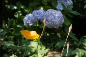
The first image of yellow and violet of the Violet/blue hydrangea and Californian yellow poppy are complementary colours, although you do have similar colours with blue and green and yellow and green. I have cropped the image to emphasise the violet/blue and yellow as below.

DSC01318

Original

crop

crop

If I am honest I still prefer the original image with the further patch of lilac giving a diagonal lead in to the frame but can see that the crop works as well

The image of the blue and orange scissors stands out as complementary colours sitting opposite one another on the colour wheel. These are very striking colours in your composition and I agree there are interesting shapes in this photograph that hold the viewer’s attention.

I also liked the unnaturalness (if that makes sense) of the strong colours of the plastics.

The bottle tops make an interesting composition with these striking red and green colours and provide a good complementary image. This is a good observational shot. The following photograph of the text and background also conform to the theme. Red text showing the word ‘fear’ confirms the danger sign associated with the colour red.

Colour harmony through Similar Colours:

The strong yellow poppy heads and expanse of green cover this category of the theme and provide a soothing illustration of the younger poppy heads turning into seedpods to the right. The overall blurring of the background give the illustration depth in a three dimensional format.

The following photograph does contain the elements of similar colours but I think I would have used this particular shot in the accented category as the bright blue ball stands out dramatically against the accentuated green background.

I debated whether to use this as an accented shot and probably should have done so (or maybe gone closer in so the blue was not so much of a spot.

The album cover suits the theme where the colours almost blend into one another even though they are definitely different colours.

I thought the triumvirate of yellow green and orange went well in, as it where, steps of similar colours i.e. green/yellow and yellow/orange.  With hindsight I probably should have shot the area behind the orange lower to get a good mix of yellow and green.

Orange and green are contrasting colours, but the green and yellow flowers in the background of DSC03107 are similar.


Colour harmony through contrasting colours:

The violet orchid is in contrast to the green grass but is a complementary colour to the yellow background as it directly faces one another on the colour wheel. The orchid certainly does stand out in 3D in this shot taken in the churchyard.

The Edge shot fits nicely into this bracket as both colours of red and yellow are primary colours.

The next image of blue and yellow also consist of primary colours. It is unfortunate that the image is not equally sharp. It is fine to show one object sharp and the opposing one diffused but the blue in this case needed just a little more sharpness.

Fair point again in hindsight I should have shot this using a tripod and with a greater depth of field.

The dark purple colour of the fuchsia flower head is very striking and it contrasts heavily with other parts of the flower head. It is one of those colours that reside in between blue and violet and difficult to categorise.


Colour accent:

The yellow flower amid the green background is a good example of an accent of colour. I like the way you have composed the shot leaving a leading edge from left to right.

In the following image of the strip of yellow colour, which is an accent amid the violet background is also complementary as you have stated.


The reflection shot of folded clothes doesn’t come over, as I believe you see it. The original image may be more vivid than the one I am viewing. I have take the liberty of trying to enhance the image by increasing the vibrancy and contrast but in so doing this has caused what is known as Newton Rings on the door reflection, It does, however, bring out some further detail.


DSC01330

Original


Cropr 2

Reworked


This is a shame as this was my favourite image out of all the ones used in the assignment and followed on from reading about Saul Leiter.  I shall keep trying on this type of abstract image.

The last image of the red spoon stands out dramatically as an accent of colour and being red in colour it is accentuated.

Not all assignments can please, but this one does help you to look for certain patterns in colour and how they fit together or not so. It is an observational exercise that gets you thinking about the relationships regarding colour. Art and garden designers follow these patterns in their quest for the most desirable designs. It is interesting to note that colours have a distinct affinity with human reactions. Red is associated with boldness, danger and love. Blue has a calming effect. I notice you have some research on this in your Blog entries. Many large companies focus on certain colours to market their brands. Have a look at the website on Colour Psychology for more information highlighted below.

I think (and hope) that maybe I picked up more from this part of the course than I realised.  I would say why colour is not necessarily a primary driver in the images I enjoy taking I am hopeful that I will be more aware of it in future.

Learning Logs or Blogs/Critical essays

https://richardbrown56taop.wordpress.com/

Keeping sketchbooks and a learning log/blog is an integral part of this and every other OCA course, not only because they constitute 20% of your marks if you choose to have your work formally assessed but they are also an excellent way to see how you are developing.


You have done some extensive research and recording in your learning log and thank you for sending me the PDF files. I imagine you will be sending the actual learning logbook for assessment, as not all the PDF files are viewable in the upright mode. Unfortunately Adobe Reader doesn’t seem to save the rotation if applied.

The format of my learning log (an A4 exercise book) makes it difficult to scan the pages the same way up and any rotation done later does not alter the file.  Its something I will have to think about in future.

Suggested reading/viewing

Useful websites to view.

http://psychology.about.com/od/sensationandperception/a/colorpsych.htm

I’ve had a look at this and have made it the subject of a separate entry.

Pointers for the next assignment

Applying Lighting Techniques


Have a look at these examples of students’ work for the next assignment.

https://stevemiddlehurst.wordpress.com/category/assignment-4-lighting-techniques/


https://robtownsendoca.wordpress.com/2014/01/29/assignment-4/

Again I have had a look at these and they are discussed in my introduction to part 4.

So overall not too unhappy with the report and hopefully the next assignment will be better!


Appendix.

Revised Assignment:-

reworked ass 3a reworked ass 3b reworked ass 3c

Assignment three Colour

The assignment asks you to take sixteen images illustrating colour harmony both through complimentary and similar colours; colour contrast and colour accent.

I have to admit I struggled with this having done similar work (and also struggled) already for the preceding exercises.  I’m not sure whether it was a lack of creative spark, or whether I rebel against going down what to me are tightly defined roads or briefs, but I tried and failed to come up with an idea I was happy with.  There was the somewhat unimaginative ideas of going round the house, or on a walkabout down the high street, to pick up the necessary mixes of colour but I did not like, as previously, the randomness of this method as there was no thread or, for that matter, personal input.  There is some satisfaction in spotting the colour relationships around me but I wanted to have more than just a random set of photos like the earlier entry I made of the rejected shots.

I also thought about doing small extracts from the record covers I own but the brief indicates that you should try and vary the subject matter.  I looked at using a local cemetery I discovered and managed to get a few shots that as featured below (on the plus side, I can see this location as being great for some of the light shots!)

In the end I used a combination of all the above

A) Complimentary colours


DSC01318

Yellow and Violet I liked the way the single flower contrasts with the slightly out of focus mass of the larger flower head.


Complimentary 1


DSC01189-2

Scissors I liked the strong colours here and thought the curves were interesting.

Complimentary 2


DSC01193

I liked the strong red making a strong image out of a relatively mundane subject.

Complimentary 3


DSC00987

The pale green reinforces the red text.

fear


B) Similar colours

DSC01320

The strong yellows are offset by the green buds which while also green still stand out from the green background

similar 1


DSC01328

The brightness of the ceramic blue ball stands out against the plain green


similar 2


DSC00984

Detail from album cover I haven’t done a simplified version of this but I liked how the green pattern is bought out by the yellow background.

DSC00984


DSC01317

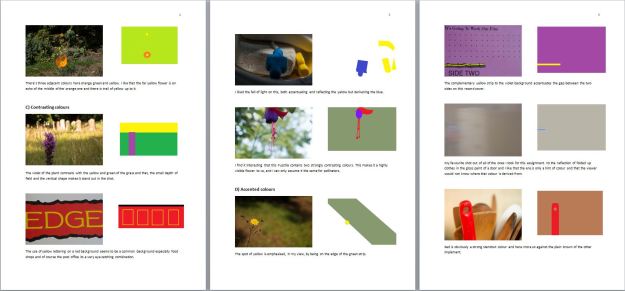
There’s three adjacent colours here orange green and yellow. I like that the far yellow flower is an echo of the middle of the orange one and there is trail of yellow up to it


similar 4


C) Contrasting colours

DSC01242-3  
The violet of the plant contrasts with the yellow and green of the grass and that, the small depth of field and the vertical shape makes it stand out in the shot.


contrasting 1


DSC00998

The use of yellow lettering on a red background seems to be a common background especially food shops and of course the post office its a very eye catching combination.

contrasting 2


DSC01327
I liked the fall of light on this, both accentuating and reflecting the yellow but darkening the blue.


contrasting 3


DSC01370

I find it interesting that this Fuschia contains two strongly contrasting colours. This makes it a highly visible flower to us, and I can only assume it the same for pollinators.


contrasting 4


D) Accented colours

DSC01234

The spot of yellow is emphasised, in my view, by being on the edge of the green strip.


accented 1


DSC00990-2

The complimentary yellow strip to the violet background accentuates the gap between the two sides on this record cover.


accented 2


DSC01330

My favourite shot out of all of the ones I took for this assignment. Its the reflection of folded up clothes in the gloss paint of a door and I like that the ere is only a hint of colour and that the viewer would not know where that colour is derived from.

accented 3


DSC01368

Red is obviously a strong standout colour and here more so against the plain brown of the other implements.

accented 4


I think this is my worst assignment to date and, for the reasons stated above, did not really enjoy it.  I think the main problem was that I struggled to input a personal voice into the both the exercises (with the exception maybe of the tablets and the medal ribbons) as well as the assignment.  As far as the assessment criteria are concerned I would make the following points:-

Demonstration of Technical and Visual Skills

Like the previous assignment I think there the use of different lenses and settings employed. There is a mix of external and internal shots and I think I’ve used the light in both effectively as well as using angles/composition to get the combination(s) I was looking for.

Quality of Outcome

While I think  I’ve taken shots that cover the brief of the assignment I would repeat that if I could have found an effective, and involving, thread to hang the images on I think it would have made for a more coherent, and better, assignment submission.  It was a source of frustration to me that I could not come up with an idea that inspired me like the Moore sculpture in the previous assignment.

Demonstration of Creativity

This is I think the weakest area in terms of the assignment.  I found myself lacking in this respect and conscious of employing some easier options.  As indicated above the only shot I am pleased with on an aesthetic level is the abstract shot of the colours reflected in the door.

Context

I have not been reading specifically for this exercise but have been looking at various documentaries on the subject of colour as outlined in my learning log.   Its also fair to say that while I haven’t applied his technique of colour photography to my own I have enjoyed discovering Saul Leiter’s work and maybe this will have some impact on how I take shots (particularly in terms of street photography in the future.  Whats interesting to me is that on this course there have been a few photographers that I have found more interesting than other and, as a result, have been keen to know more about them.  Leiter is definitely in that category and I will be looking further.

I would also add that the exercises and assignment has made me a lot more aware of colour relationships – possibly not that difficult given my previous lack of knowledge on the subject – and it will be something I will be aware of, and hopefully incorporating a lot more, in my photography.


Colours into tones in black-and-white

“Black and white are the colors of photography. To me they symbolize the alternatives of hope and despair to which mankind is forever subjected.” – Robert Frank.

As mentioned earlier I have always been biased towards black and white, but have not considered the use of filters (or their digital equivalent) and the effect of that use.


DSC01011-2

Original all settings in lightroom zeroed.

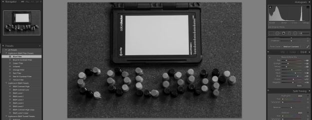
I converted the image to black and white under the HSL/Colour/B&W section of Lightroom.

B&W

Conversion to black and white, note variation on colour sliders

Lightroom has, under its own pre-sets the four filters relevant to this exercise yellow, red, blue green and red.  I’ve shown in the images below the changes in the colour sliders as a result of using the pre-sets.

yellow filter

Using yellow filter in Lightroom. Yellow becomes almost white; green and red become lighter while blue appears to be disproportionately darker. The grey seems relatively  unaffected.

redfilter

Using red filter in Lightroom.  The colours all become even lighter, although blue is not as affected, as does the greyscale.


Greenfilter

Using green filter in Lightroom.  Green is slightly lighter, blue, red and yellow darker and greyscale back to normal.

bluefilter

Using blue filter in Lightroom. Blue becomes very light while red darkens significantly as does yellow but green is relatively unaffected.

As the course book says the exercise gives some indication of how the use of filters can accentuate an aspect of an image.  As an example I took this image on a trip to London:-

DSC01102-3

Original

The black and white conversion does nothing to alter the overall feel of the picture:-


DSC01102-4

B&W

But when the blue filter is used notice how the skin tones change dramatically.

DSC01102-2

Blue filter applied

Of course you would need to be judicious in their use but it illustrates the impact these filters can have and it will be something I ‘ll be considering in the future.


Colour exercises – other shots

I thought I would include these shots as a separate entry, as they represent my initial work on the exercises and, to a degree, the assignment.   While I think they fulfil the function of meeting the brief of the exercises, I found that they were not making me very involved with them as they were as a result of me taking several trips around the village as seen with no clear relationship between the shots.  I guess as I thought they were just photos and there was no personal point of reference I felt that they were just a little bit too constructed and impersonal for what I wanted to do.

Nevertheless I thought it might be interesting to show some of them as they do illustrate the range of colours available:-

DSC00911-2  DSC00910-2  DSC00909  DSC00908 DSC00907-2 DSC00906 DSC00904 DSC00903 DSC00900 DSC00898 DSC00897 DSC00895 DSC00937-2 DSC00930-2 DSC00928-2 DSC00927-2 DSC01015-3 DSC01037 DSC00887 DSC00885-2 DSC00884 DSC00875 DSC00872  DSC00864     DSC00890-3DSC00858   DSC00883-2  DSC00879  DSC00881-2  DSC00863-2   DSC00857

DSC00882     DSC00889-3  DSC00870

It seemed to me that the two most common relationships were red/yellow and green/red.  Of all the colours on the circle violet was the hardest to locate, as can be seen from the above selection.  Interestingly violet was, with one exception, really only available as a natural colour in plants.  Its not used in signage as much as the other five it seems to me.  I guess it is, as is demonstrated by the ratios previously described, not a bright (and therefore eye-catching) colour.


Colour relationships

The first part of this exercise asks you to shoot three photographs illustrating the ratios outlined originally by J. W. Van Goethe based on the relative brightness of the primary and secondary colours.  He theorised that red and green were about the same brightness while orange is about twice as bright as blue and yellow about three times the brightness of violet.  It then follows that the ideal proportion of these colours in the frame follow their respective brightness where these are the two colours involved.  Thus red and green should be equal; there should be twice as much of blue than orange and three times as much violet as yellow.

I found it interesting consider how this relates to our eye being drawn to red?

Of course the question then arises how to illustrate this?  I did, both for the this exercise and the assignment, consider going out to see what I found on the streets.  Some of the examples of this are shown in the next blog entry.  However I revised my thinking to a more personal subject – the drugs in the Brown household:-

DSC01044-2

Red:green 1:1


DSC01041

Orange:blue 1:3

DSC01040-2

Yellow:violet 1:3

For the second part of the exercise you are asked to produce three or four images that have a personal appeal as to the colour combinations therein.  I thought about the colour in our garden and again some of the results are shown in the next entry.  What sprang to mind was to illustrate an old childhood memory the subject of which fortunately still exists.  These are the ribbons from the first world war medals given to my grandfather.  They are not exceptional in terms of rarity or anything like that, but nevertheless they used to (along with the medals themselves) fascinate me as a child.  On considering this exercise it occurred to me how the colours in these ribbons are almost garish and clearly designed to be very visible when worn:-

DSC01006

Note how in this ribbon the orange is the dominant colour and its area exceed that of the combined blue stripes


DSC01007

The red and the blue are not complimentary here but I like the gradual merge (possibly caused by age) into the white.


DSC01009

A real mash up of colour here creating on close inspection an almost psychedelic effect, but clearly very noticeable when shown against a plain black or dark blue background.


DSC01005

Slightly more subdued but effective in that it has an approximation of three of the colours on colour circle albeit in a different order.

DSC01008-2

Finally there is a good example of complimentary colours with the red and the green being equal in area. In terms of wearing the ribbons the red would obviously be a strong visual marker.

DSC01060-2

The combined effect. I’m not sure in which order they are meant to be, but collectively they make a strong visual.


Primary and secondary colours

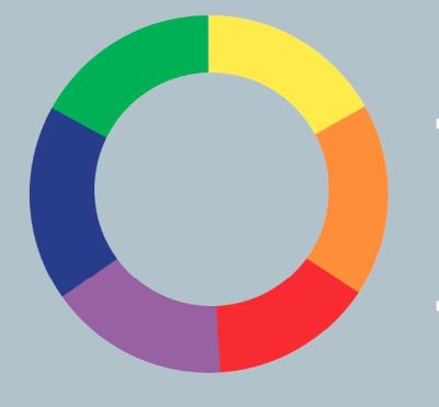
The requirement of this exercise is to find a scene or scenes dominated by a one of the six single colours of the primary or secondary category:-


Colour Wheel

Originally I had in mind selecting part of the high street and take colour swabs so to speak of what I saw there.  Another idea was to go in a shop and see if I could get the full range in there.  I also had the idea of seeing what options were closer to home and thought it might be interesting to do an experiment and see if I could identify, or at least get close to, the colours in the circle on a macro level.  Its interesting to note that on my, calibrated, monitor the six colours are much more distinct than the printed version.  I chose the bathroom to do this as such colour there is in there, is on a relatively small scale:-

DSC08287

The Bathroom

DSC08289

Detail of label F2.8 @ 1/60 ISO200


DSC08291

Detail of label F2.8 @ 1/40 ISO200 (exposed as -.7 stop)

violet

violet


DSC08293

Detail of label F2.8 @ 1/15 ISO200 (exposed as +.7 stop)

Of the three above I thought the last one is an approximation of the violet in the circle but at the time I was shooting I was using a printed version of the circle and now on examination its not as close as I thought it was!


DSC08300

Tube end detail F2.8 @ 1/10 ISO200


DSC08303

F2.8 @ 1/20 ISO200 (exposure reduced by -.7 stop)


blue

blue

DSC08302

F2.8 @ 1/6 ISO200 (exposure increased by .7 stop)

In the case of the blue I think the underexposed version is a much closer match.

For red I used a bottle cap:

DSC08324

Bottle cap F3.3 @1/10 ISO200


DSC08323-2

Bottle cap F3.2 @ 1/20 ISO200 underexposed at .7 stop


red
red


DSC08325

Bottle cap F3.2 @ 1/8 ISO200 overexposed at .7 stop.

To my eyes this time the overexposed shot comes very close to the circle colour.

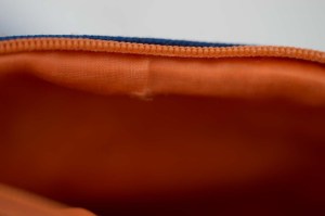
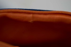
The Orange I found was the interior of a wash bag.

DSC08321

Washbag F2.8 @ 1/13 ISO200


DSC08322
Washbag F2.8 @ 1/20 ISO200 underexposed at .7 stop


orange

Orange

DSC08320

Washbag F2.8 @ 1/6 ISO200 overexposed at .7 stop


The yellow was a detail from the artificial flower on the windowsill

DSC08308-2

Petal edge F2.8 @ 1/200 ISO200


DSC08309
Petal edge F2.8 @ 1/320 ISO200 underexposed at .7 stop


yellow

DSC08310

Petal edge F2.8 @ 1/125 ISO200 overexposed at .7 stop


To my eyes the very edge of the petal is the closest to the yellow but, interestingly, the out of focus area on the right hand side is also a good match in this shot.

For the green I used a shampoo bottle.  This was quite reflective and because of its position in the bathroom one edge was more in shadow so there was a difference in the shade of green straight away.:-

DSC08305

Bottle at F2.8 @1/30 ISO200


DSC08304

Bottle at F2,8 @ 1/40 ISO200 underexposed by .7 stop

green


DSC08307

Bottle at F2,8 @ 1/13 ISO200 overexposed by .7 stop


Of the three shots I think the right hand shade of the overexposed shot is the closest although, as the course book indicates, there is a lot of variance in green!

I found this a useful exercise as my colour sense is not particularly strong in terms of identifying shades and is something worth developing or practising.


Controlling the strength of a colour – cameras with a manual option.

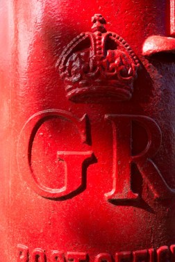
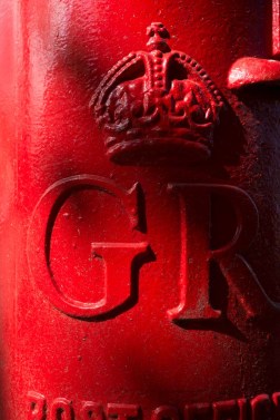
My original idea was to take a shot of the blue screen of my television but dismissed this because of the reflection in it.  The next idea I had was the post box just down the road which fulfilled the criteria of a strong definite colour:-

DSC08263

F5.6 @ 1/320 ISO200 (aperture priority)

DSC08264-2

F4 @ 1/320 ISO200 (manual)


DSC08265

F4.5 @ 1/320 ISO200 (manual)

DSC08266

F6.3 @ 1/320 ISO200 (manual)


DSC08267

F8 @ 1/320 ISO200 (manual)

Out of interest I measured the RGB scale at the top of the shape in the letter G.  In the “correctly exposed” F5.6 shot it was 184.  At F4 255; F4.5 252; F6.3 180 and F8 151.  The minor difference between F5.6 and F6.3 could be due to a change in daylight values?

In any event the red in the F4 shot is far weaker and not as striking as the F5.6 shot but, as might be expected, the F8 shot provides a much deeper, vibrant and somehow more solid red.

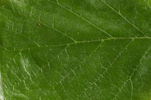
I thought I’d try the exercise with Green and Blue to see if there was a noticeable difference in the change of colour with the same range of exposures.  For the green I used a leaf from the garden.  It had a fairly reflective surface and its interesting to see with the underexposure at F8 the differences in the reflecting and less reflecting areas is not as obvious:-

DSC08278

F5.6 @ 1/3 ISO200 (aperture priority)

DSC08279

F4 @1/3 ISO200 (manual)


DSC08280-2

F4.5 @ 1/3 ISO200

DSC08281-4

F6.3 @ 1/3 ISO200 (manual)

DSC08282

F8 @ 1/3 ISO200 (manual)

Of the shots above I think, to my eyes anyway, that the F6.3 shot is probably the most accurate as the 5.6 one is a tad too light (and more reflective in terms of highlights) although it is a close run thing between this and the F8 shot.  This seems to echo the red pictures above

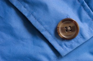
For the blue I used a nylon jacket :-

DSC08273

F5.6 @ 1/3 ISO200 (aperture mode)

DSC08274

F4 @ 1/3 ISO200 (manual)

DSC08275

F4.5 @ 1/3 ISO200 (manual)

DSC08276

F6.3 @1/3 ISO200 (manual)

DSC08277

F8 @1/3 ISO200 (manual)

I this case I think the 5.6 shot is pretty close but again its close with the 6.3 shot.

As to what can be inferred from this test (albeit a very rough one) I think there may be an argument to say that variations of exposure from the norm may be appropriate depending on the colours involved.  It is the case that there are a loot of variables involved here, the  camera takes an average meter reading , light may change, reflectivity etc.  The answer, I guess is to experiment both at the point of taking the shot (assuming time permits such experimentation) or in post production.

It also shows that my recollection of colour is not good as memory (well mine anyway) is an unreliable guide.  To combat this shortcoming I often use (although not as often as I should) this little accessory:-

DSC01020-2

X-rite color checker passport

This enables me to make accurate white balance settings (when I remember) and create colour profiles in lightroom for my cameras as well as being a handy point of reference for colour.